Showing posts with label sketchbook. Show all posts
Friday, 22 June 2012
Marks on a page
Just using up the dregs of a dye bath, markmaking without a specific purpose. Pondering on a question someone asked the other day; what is the difference between a dye and an ink? Any thoughts?
Monday, 16 March 2009
Sunday 15th March
Sunday's walk to St Ives produced further 'threads' made using plant stems and the addition of some purple crocus. I like the gold thread I used to bind them, it seems to sum up the glittering of birdsong and warmth of the spring sunshine.
I also made a sketchbook and concentrated on making observations in different locations. Below is a sketch of one of the beautiful tiny patches of lichen I found on a wall at St Ives. I tried to make plenty of notes about colours and tactile qualities. I liked the way the spots on the lichen look similar to the spots of lights on my new CAD images. The lichen also looked like a miniature Earth surface; I'm interested in how tiny things often look like massive things just on a different scale.
Further reflections were that for me walking may be the same as searching (both subjects that arose in my reverse mind mapping. So if walking is searching, finding is sunlight illuminating a discovery - epiphany.
I also discovered that perception is very important to me when walking in the countryside. Catching something out of the corner of my eye, or on the edge of consciousness involves a shift of perception and reveals hidden dimensions. Time is also crucial in how we perceive our environment; over-familiarity or too brief a glance only provides limited information, a selective snapshot. Spending some time to settle into an environment allows us to adjust our speed to our surroundings and to notice things fully.
I think I need to think on these things a bit more.
Saturday, 14 March 2009
Reviewing the busy book
I decided to review the work I have been doing in my mini book today. The purpose of this book was to be a portable (pocket sized) sketchbook to record aspects of the busy urban environment and mass communication. I wanted to create a book full of images with a layered appearance, where the images and fragments of information all jostle for attention. I carried the book with me when commuting to work or university and tried to work with immediate marks and instant media such as marker pen.
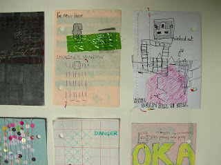
To review the book I took the pages off the rings and laid them out as individual sheets. I soon noticed that, of the most successful sheets, there were three distinct styles. The ones above have the kind of effect I wanted and expected; loud, bold images with strong areas of lettering or symbols, large in scale with the page. The images below have more detailed areas observing details on the train or in the built environment. They have a more illustrative quality but also look like the product of boredom, with repeated elements and doodle-like style. There is a bit more space in these pieces, which is possibly why they appeal to me so much.
The final group I identified as having a different visual character was the photography. There were a small group of photos that I manipulated in Photoshop, I put these in the book originally to draw over, but found it difficult to do this. The image below got the best response from the rest of the MA group. They felt it clearly portrayed the speed of the urban environment, and thought it was a fascinating image.
Wednesday, 11 March 2009
Collecting Colours
Continued on from the previous posting.
As well as using the handmade sketchbooks for drawing I also wanted to think, and also influenced by my making some onion skin dyes for my students, I thought it would be interesting to see what colours I could get from the environment along my walk. Rather than making potions I was keen to just get a direct stain there and then. The first one was just dark mud from the footpath and then on later walks I came across old crab apples and rose hips that were very soft having been weathered all winter.


Again all this ties in with the idea of working with what you find in the landscape (like the cyanotype photos). I enjoy working in this way, although it is sometimes frustrating. However I don't think any of this really tackles my emotional response to the environment. It is really still observational, just in a non-traditional format.
Walking and thinking
Alongside the work I have been doing exploring my responses to the urban environment and commuting (images to be included in a later blog) I have also been walking in the countryside as a means to record my emotional response. I have been using small handmade sketchbooks (made quickly & roughly before I leave the house) and going on short walks into the nearest surrounding countryside.


I think I wanted to make abstract responses rather than recording what I see physically in the landscape but I have found this very challenging as it is not my 'normal' way of working. These are some of the sketchbook pages I think are most successful so far, although they are still very observational.
The pieces in colour were finished at home because it was too cold to be painting outside. I wrote really good notes about the colours and did the colour mixing study above straight away when I got in. I think the coloured sketches are some of the best because they have the spontaneous pencil marks from working on site but the carefully mixed colours add to this and make them more considered.
I also created a long thin drawing on watercolour paper after returning to the studio - taking the idea of a walk as a line. I like the use of colour on this piece and the simplicity of the piece; just simple pencil marks and coloured stains.
I will write more about the walks and sketchbooks, etc in another blog, as this one is getting a bit long.
Thursday, 19 February 2009
Reflections
Following a tutorial on Tuesday a lot of questions have been raised for me. I have been doing a lot of thinking, discussing, walking and writing to sort out some of my thoughts. I think this blog is a good way for me to summarise those thoughts:

- The sun prints (cyanotypes) have a beautiful quality and seem to capture a moment, something very ethereal. This is definately something to pursue further
- I should not look at my project as pursuing two different, opposing subjects (over-stimulated versus quietude) instead I should explore my emotional responses to a sense of place and time
- There is a danger in making work purely on aesthetic grounds (pretty pictures), which is instantly gratifying but has no lasting creative satisfaction
- Serendipity is an important aspect of my work
- The information I have collected on various artists and designers may well be relevant but I need to take the time to understand what I can learn from it; how does it relate to the work I am doing?
- My journal needs to be useful for me. I should not be concerned about how it might be viewed by other people.
- My journal should be a visual tool, at the centre of my practice and is probably closer to a sketchbook than anything else
- I need to be myself and stop trying to be everything I think is expected of me
- I will try to make emotional responses to a sense of time and place through observation using whatever media is most appropriate; paint, drawing, stitch, working with found objects, etc.
Subscribe to:
Posts (Atom)