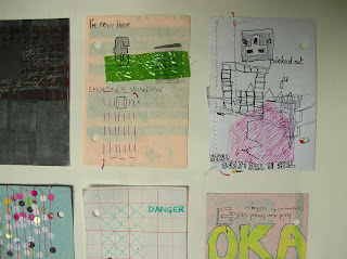
I decided to review the work I have been doing in my mini book today. The purpose of this book was to be a portable (pocket sized) sketchbook to record aspects of the busy urban environment and mass communication. I wanted to create a book full of images with a layered appearance, where the images and fragments of information all jostle for attention. I carried the book with me when commuting to work or university and tried to work with immediate marks and instant media such as marker pen.

To review the book I took the pages off the rings and laid them out as individual sheets. I soon noticed that, of the most successful sheets, there were three distinct styles. The ones above have the kind of effect I wanted and expected; loud, bold images with strong areas of lettering or symbols, large in scale with the page. The images below have more detailed areas observing details on the train or in the built environment. They have a more illustrative quality but also look like the product of boredom, with repeated elements and doodle-like style. There is a bit more space in these pieces, which is possibly why they appeal to me so much.


The final group I identified as having a different visual character was the photography. There were a small group of photos that I manipulated in Photoshop, I put these in the book originally to draw over, but found it difficult to do this. The image below got the best response from the rest of the MA group. They felt it clearly portrayed the speed of the urban environment, and thought it was a fascinating image.

No comments:
Post a Comment